Coloring/theming
Color
The color scheme as well as some sizing options can be configured via the theme. This is done via a top-level configuration in the config file. For example:
{
  "configuration": {
    "theme": {
      "palette": {
        "primary": {
          "main": "#4400a6"
        }
      }
    }
  }
}
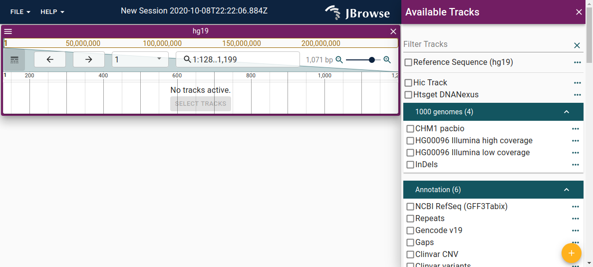
JBrowse uses 4 colors that can be changed. For example, this is the default theme:


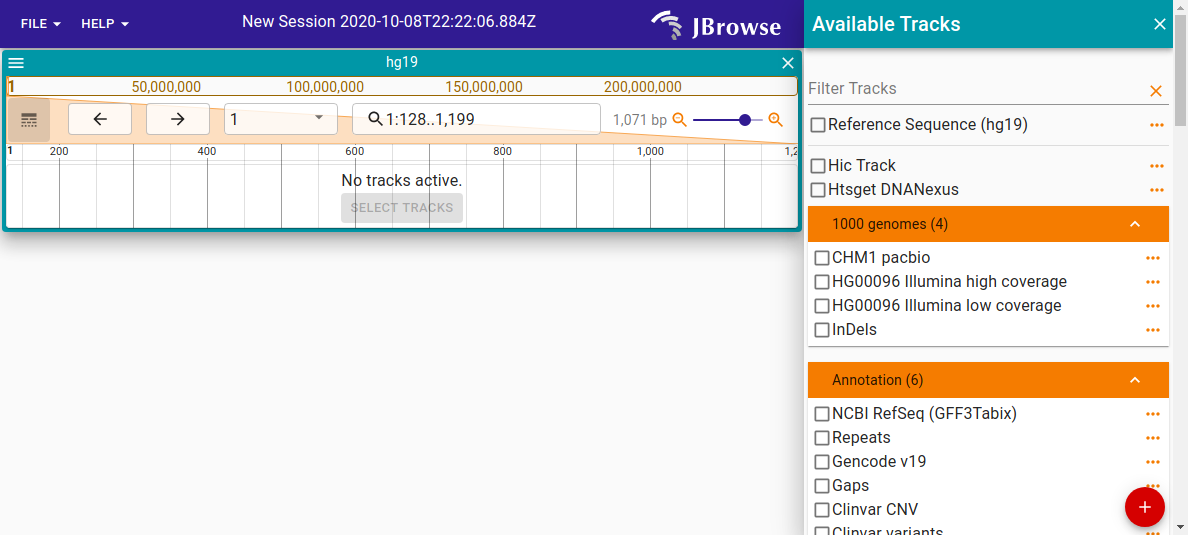
The customized theme screenshot uses the below configuration:
| Color code | Color | |
|---|---|---|
| Primary | #311b92 | Deep purple |
| Secondary | #0097a7 | Cyan |
| Tertiary | #f57c00 | Orange |
| Quaternary | #d50000 | Red |
{
  "configuration": {
    "theme" :{
      "palette": {
        "primary": {
          "main": "#311b92"
        },
        "secondary": {
          "main": "#0097a7"
        },
        "tertiary": {
          "main": "#f57c00"
        },
        "quaternary": {
          "main": "#d50000"
        }
      }
    }
  }
Extra themes and dark mode
In v2.4.0 we introduced the ability to add extra themes via the config. In jbrowse-web and jbrowse-desktop, these show up in a "Preferences" dialog that the user can select from. We also added better support for dark mode themes. Adding "mode": "dark" to your theme will use MUI's dark mode https://mui.com/material-ui/customization/dark-mode/
Example
{
  "configuration": {
    "extraThemes": {
      "myTheme": {
        "name": "My theme",
        "mode": "dark",
        "palette": {
          "primary": {
            "main": "#311b92"
          },
          "secondary": {
            "main": "#0097a7"
          },
          "tertiary": {
            "main": "#f57c00"
          },
          "quaternary": {
            "main": "#d50000"
          }
        }
      }
    }
  }
}
Logo
It is also possible to supply a custom logo to be displayed in the top right corner of the app instead of the JBrowse 2 logo. To do this, store a SVG file containing your logo on your server, and specify the path in your configuration:
{
  "configuration": {
    "logoPath": {
      "uri": "path/to/my/custom-logo.svg"
    }
  }
}
The dimensions of the logo should be 150x48px.
Sizing
You can also change some sizing options by specifying the "typography" (to change font size) and "spacing" (to change the amount of space between elements) options:
{
  "theme": {
    "typography": { "fontSize": 10 },
    "spacing": 2
  }
}
Advanced
JBrowse uses Material-UI for its theming. You can read more about Material-UI
themes here. Generally,
most options that you can pass to Material-UI's
createTheme
should work in the theme configuration.
Some aspects of the theme, like style override, can accept callback functions which is not available via the config, but could be added via a plugin. See https://github.com/GMOD/jbrowse-components/blob/main/test_data/volvox/umd_plugin.js for an example of adding a theme via a plugin. This example also contains examples of overriding the 'default' theme from a plugin